I was quite excited when I saw the new road signage being installed on Columbia Avenue until I looked closer and saw that the attractions on them are written upside down. In North America we read horizontal signs from left to right and vertical signage from top to bottom. The new signage has the attraction name starting at the bottom and going up?
It’s a puzzle for sure.
Fred Hughes
Castlegar, BC
————————————————————
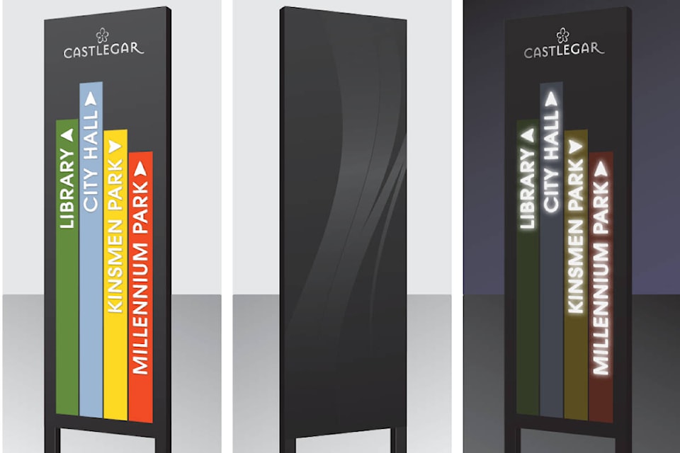
I’ve been noticing these new multi-coloured strip-signs along Columbia Avenue. Supposedly, these signs are being placed to help us and travelers locate city and area sites.
I don’t know if city councillors and/or city staff did any field testing of these signs, but I believe the signs don’t do what they were intended for. They are too difficult to read while drivers are passing by. Partly, this has to do with the up-and-down print, which is difficult at any time to take in.
Another problem is the strip-signs are positioned parallel to Columbia, and because drivers have nowhere to stop to view the signs, the messages on them are difficult to pick up. I have been up and down Columbia several times in the past few days and still do not know all the sites listed on the strip-signs. Even passing by at a slow speed, it’s impossible to take in the information because of the format.
The tiny arrows at the top of each strip don’t help drivers either.
The only positive about the signs is the colour, but what good is that when the messages can’t be read by drivers going by!
Gord Turner
Castlegar, BC
READ MORE:City considering sani-dump near Doukhobor Discovery Centre
newsroom@castlegarnews.com
Like us on Facebook and follow us on Twitter